VideoGame cover


Blu Ray PS3 PS4 Xbox One Cover Design Template

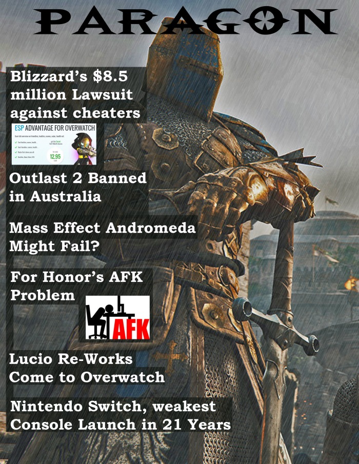
The project was to make a game cover or a movie cover and the way I did was to just collage pictures together to make a coherent cover. The game I went for was Dark Souls, because the Dark Souls franchise is one of the best in my lifetime.  My cover is form an existing game, it is meant to be a DLC, I made it because i’m going to miss this game series.

I mainly, at least for this project worked with collage because there is a lot that goes into making a game cover. I also worked in Photoshop for this project. I worked in Photoshop because Photoshop to me, is much more user friendly as well as easier to use.

I think overall i was successful with this project just mainly because a can look at it and another gaming magazine and see a lot of similarities from one to the other. If i did this project over again I would do nothing over again because i feel like it is nice and good the way it is.

magizine cover

Magizine Cover

How I did this project was I took a picture from a recently released game and overlay-ed  a rain effect to give it more a dark and cinematic feel to the overall picture. I then searched for some recent game news to plaster on the front of my cover. I put in some faded black boxes behind the words to make them stand out more.

I choose to work in photoshop because I am more comfortable in it. The proscess for making this was that I looked for game news and found a picture i liked and put them together. I choose the theme by drawing out of a hat.. I just kind of let ideas come to me, I didnt really think about it to much i just kinda let it happen. I came up with the story lines by just browsing game forums looking for gaming news. I tried to add a lighting and rain effect into my design and I think it came out rather well

I think overall i was successful with this project just mainly because a can look at it and another gaming magazine and see a lot of similarities from one to the other. If i did this project over again I would do nothing over again because i feel like it is nice and good the way it is.

Rob Harrig Half and half

The project was for the most part just just lines that I connected and made into spikes. I then added in the colours into the spikes and made sure non of the colours were the same. I intentionally made the background blank to kind of push out the fore ground colours and make it look more layered as intended.

The process of making this was very simple, all I did was draw lines and then fill those lines in different colours. The subject matter I chose to use are just lines, because they are simple and make good things.  I created my digital part of my project in Photoshop because I just personally find it easier to work with. The only tool I used was pen tool to fill in the spikes.

I felt I was successful with this project because it looks nice and there is a lot of overlap and colours, as well as some  emotion. This project has had some effect on projects of the future. I would do this project the exact same if I were to do it again, maybe with different sized spikes and different colours. I think i’ll implement the use of the pen tool again because it was very useful and very easy.

Dream Home rendering

Dream Home

Architecture is both the process and the product of planning, designing, and constructing buildings and other physical structures. Architects design all kinds of buildings. Before constructing a building, an architect needs to draw a plan of the building. Sometimes architects will make a cardboard or plastic model of the building. I would not like to work as an architect because it just doesn’t appeal to my interests and seems pretty boring.

My process for making this to make everything out of cubes because i really like the way that the cube looks implemented into a house. I implemented a more modern and cubic style to my house. I show the style in my rendering by the open layout, and the cubed style of the building.

I think I was vaguely successful with my project because i think i showed  how the building i molded after looks. This project has shown me to be more make me care a bit more with how I do things in my class. But overall I doubt that I will implement anything that I did in this project into other projects.


Robert’s Vision board

Robert flickr


I made my Vision Board using a new tool I’ve never seen, it was the perspective tool. Which I used to make each program logo seem to fit each picture frame. To do it I had to hold down a corner or edge to the side I wanted to close in and the i pushed the edge or side to the center,and the closer I get the more dramatic the perspective change.

All of the different framed Adobe-TM logo’s highlight the key programs I want to tackle this semester. I choose these six programs because they highlight my idea of an all around coverage for what programs need to be learned. The Mona Lisa was put there sideways just cause It illustrates my feeling that a class like this shouldn’t need to be void of having fun in each project.

The project was very difficult because the perspective  tool did not work the way I thought it would’ve. But once I got by the odd movement for the perspective tool, it became increasingly easy to work with as well as use.

I think my project came out very well but it still needs a little fixing in my opinion. If I could redo it I would slightly change the placement of the logos  and I would have liked to add in logos for the rest of the frames.


The steps I took to get to make my life poster were to go to the internet and take very simplistic and easy shapes to put into my life poster. and then I decided to make the colours something that would complete each other. those two colours being blue and a slightly darker blue.

If someone was to watch the trailer for my life movie poster they would say that it was very repetitive. But the trailer was inspiring and boring.

Skyfall1_aw_black-swan_style_a_retGodfather

I picked these three posters because they all have a small thing do with me. the godfather poster shows the lack of control over my own life in that I am more of a puppet and everything is planned for me. The black swan poster tells of the repetition in my life, and how everything that happens is just a repeat of stuff that happened before. And the skyfall poster shows that I stand alone and that this is my life an no-one elses.

I see across all of the posters a very simplistic design, the use of just two or three colours. There is big black block lettering instead of small print across all three posters.

The movie of my life would be about constant failures and losses. But at the same time would be about that life is kind of meant to be that way. And in the end life is worth living no matter what struggles and losses and Failures you happen to come across.

Ray Narvaez Jr. Typography Portrait

Lyrical face 2

Art by: Robert Harrig

I choose this person because he is very funny and I have been watching his content on YouTube for a very long time, the words and phrases I used are “Rayisms”, things he says in video’s that you associate with him. Ray inspired me by being very funny and sarcastic, and the way he looked at things always had him laugh at himself, and I have tried to model myself after him.

I’d say this is the only project I’ve done in this class that I have fully understood, and have enjoyed. Out of all the digital design styles we have learned, Typography is absolutely my favorite because we are taking a photo and  manipulating it into an art style that we can appreciate.

Flickr2WordPress Collage

Collage

By: Carlos Vega Moreno

The colors I see in this collage are white, grey and black. The lighting is mainly focused on the skull and the ground around it, along with the buildings in the background. The perspective of the collage appears to be from the ground looking slightly up towards the sky. The items I see in the collage include a blimp in the background, a skull, a few buildings, birds, and clouds. The texture of the ground looks like it would feel very hard and sharp rock. The artist also emphasized the skull to give the artwork a  bit more of a depressing feeling. I think the intention of this artwork was to illustrate death and life within this heavily technological community we now live in.

I think the creator is trying to communicate that death is always happening and that when it happens we are split off from everyone and put on our own way alone. I think the mood is meant to be depressing because of the skull and the black, grey and white colors used throughout the piece. I think they chose this particular subject matter and angle because death is a very real thing and the artist is trying to emphasis that when you die you are split off from everyone. I think the image is strong in what it is trying to communicate because it really has that kind of feeling. I relate to this piece because I have seen death and I know that the person who died is no longer a part of my life or anyone else’s, they are gone forever. I would like to ask the artist if I ever got the chance, what exactly he meant the artwork to mean, why did he make it and what is the artwork saying. I would also love to incorporate the three singular colors of black, grey and white because I like the contrasts you can make with just those three colors.